Escapes — Freemium Signup & Conversion Upsell
A sanitized recreation of subscription flows I designed at Travel + Leisure GO
The original work was built on Travel + Leisure's member-gated platforms, so this is a sanitized recreation — rebuilt from my own work to show the experience and decisions without proprietary assets. The demo product, “Escapes,” is my own neutral mockup.
- Role
- UI/UX Design & Front-End Development (embedded with the business team)
- Context
- An enterprise travel and lifestyle platform serving millions of members across 50+ countries.
Overview
Turn new visitors into paying subscribers without scaring them off at the front door. The product needed to let people sign up and experience real value for free, while protecting premium content and prompting upgrades at the right moment — balancing user trust against business conversion.
What I Designed
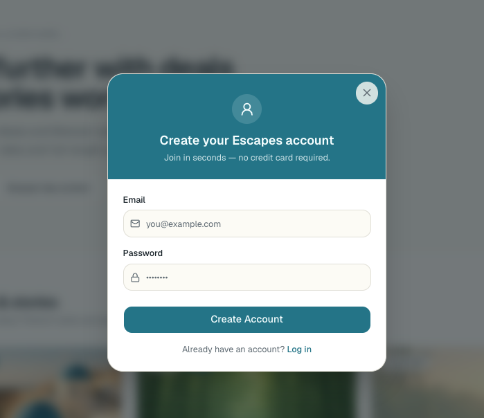
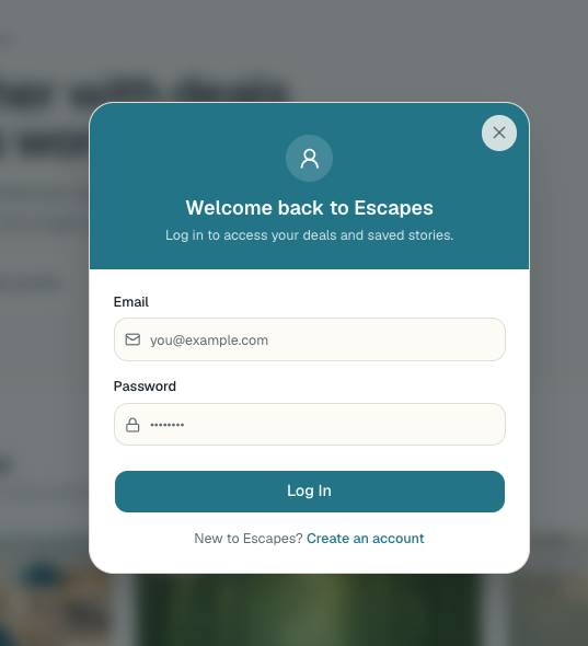
- A low-friction signup flow that let users get in and explore quickly, feeling the product's value before being asked to pay.
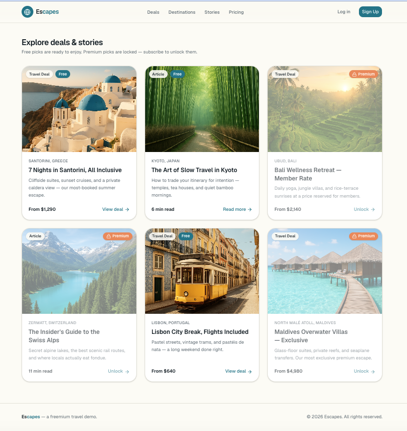
- A tiered content experience with clear visual signaling: premium content given a deliberately disabled appearance (reduced opacity + corner lock badge) and gated in JavaScript, so users instantly understood what was free versus locked.
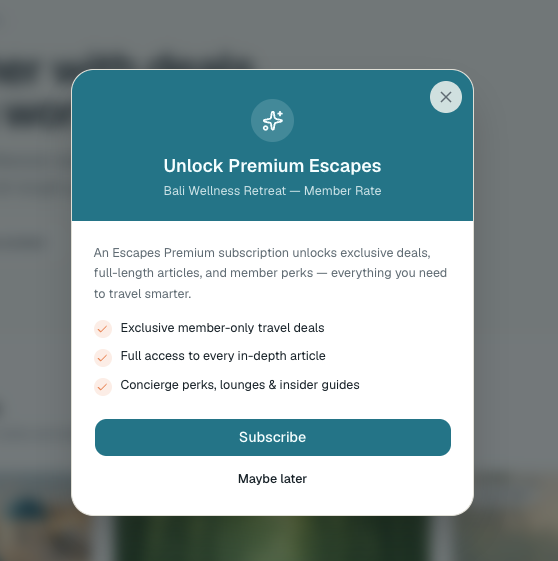
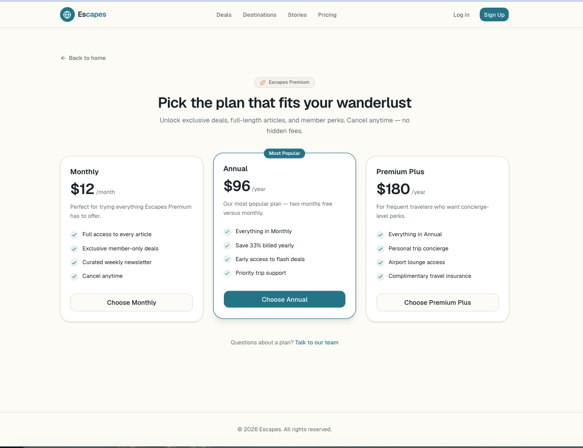
- A contextual upsell modal that fired the moment a user engaged a locked feature — a centered modal over a dark overlay with member perks and a Subscribe button leading straight to the paywall.
- Fully responsive layouts for mobile, tablet, and desktop, validated in testing before sign-off.
The Thinking
Catching users at the moment of intent — right when they reached for something they wanted — converts far better than asking upfront or interrupting too early. The disabled styling set expectations before the click; the overlay modal captured full attention at the decision point; and the direct path to the paywall removed friction between “I'm interested” and “here's how to get it.” Free access built trust, the gating protected the business, and the prompt connected the two into one natural step.
Process & Collaboration
I worked as the dedicated web developer embedded with the business team, designing and building these flows end to end. Every layout went through responsive testing across screen sizes and was approved by my project manager before launch — balancing user experience, business goals, and a real shipping and QA process.
The Flow
The complete experience, screen by screen — from free browsing to the moment of conversion.